

Typography shapes clarity and tone. For beginners, pair a readable serif for body text with a clean sans-serif for headings, keep contrast subtle, and limit to two families for consistency.

Master the Rule of Thirds by aligning key subjects to grid intersections, creating natural tension and visual flow. Balance negative space and horizon placement to guide attention without centering.

Visual hierarchy guides attention through scale, contrast, spacing, and alignment. In modern layouts, clear focal points, consistent typography, and deliberate white space improve comprehension and reduce cognitive load.
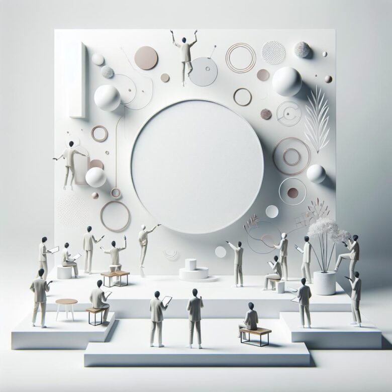
White space isn’t empty; it structures content. By separating elements, it boosts readability, guides attention, and reduces mental load-helping readers scan faster and absorb key messages.
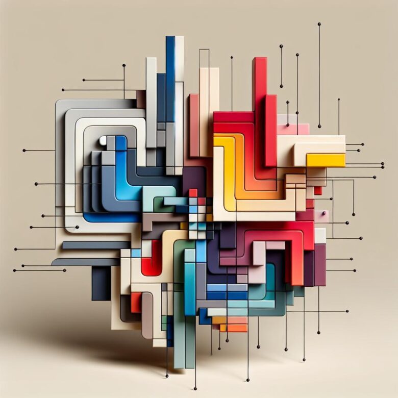
Color shapes expectation and action: warm tones can trigger urgency, cool hues build trust. Use contrast to guide attention, and keep palettes consistent to reduce cognitive load and improve conversions.