

Raster graphics (pixels) shine in photos and rich textures, but blur when scaled. Vector graphics (math) stay razor-sharp at any size-perfect for logos, icons, and print.
Month: February 2026
Scalable vector branding keeps logos sharp from app icons to billboards, preserving color, geometry, and credibility. One master file adapts instantly-no pixel blur, no costly redraws.
Start with your brand’s purpose, then define voice, logo rules, color and type systems. Add do’s and don’ts, real examples, and a simple checklist so every touchpoint stays unmistakably you.
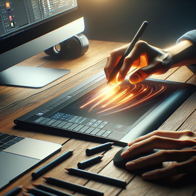
Master Illustrator faster: V toggles Selection, A for Direct Selection, P draws Pen paths, Shift+Ctrl/Cmd+O outlines strokes, Ctrl/Cmd+G groups, and Ctrl/Cmd+Z undoes-rapidly.

Build high-converting social graphics with one bold promise, a single focal image, and ruthless contrast. Use brand fonts, mobile-first spacing, and a clear CTA-then A/B test color and copy.

Visual hierarchy guides attention through scale, contrast, spacing, and alignment. In modern layouts, clear focal points, consistent typography, and deliberate white space improve comprehension and reduce cognitive load.

Optimize images by compressing and resizing to display dimensions; prefer WebP/AVIF, add responsive srcset, lazy-load below the fold, and strip metadata to cut bytes and speed rendering.

Professional stationery gives small brands big-brand polish: coherent logos, readable type, calm white space, and consistent colors across cards, letterheads, and envelopes-so every note looks deliberate and trustworthy.